Gimlet v2 - Updated Design
Hi all,
Eric here for the Gimlet team. Work on Gimlet v2 is coming to completion soon. SO! To begin the celebration, I’d like to start a new blog series previewing some of the new features and advancements we’ll ship soon.
My favorite feature of Gimlet v2 is the updated data-entry page design, so let’s begin here.
Stay up to date on everything related to Gimlet v2
Send us your email address and we'll email you with all the important news and updates.
Keep me up to date!An Oldie, But a Goodie
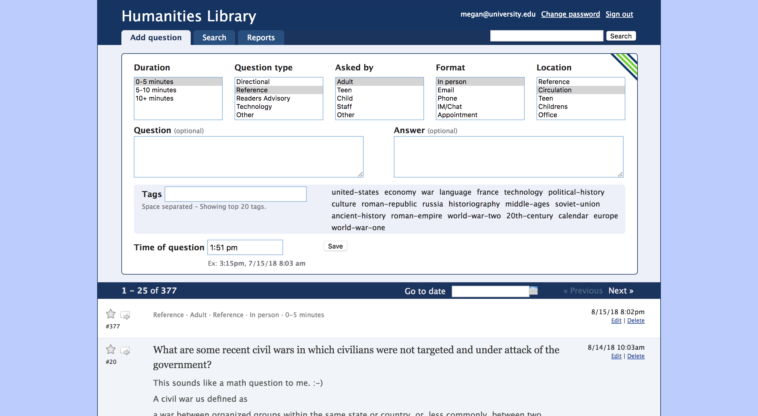
The primary entry form for Gimlet v1 is a thing of minimalistic beauty. It’s simple to use, highly intuitive, and comfortable to drive all day long. Over the years, over 38 million entries have been submitted through this form – that in itself is a wonderful proof for Keep It Simple, Stupid (K.I.S.S.) based web design. Simple is always productive.

Updated Design

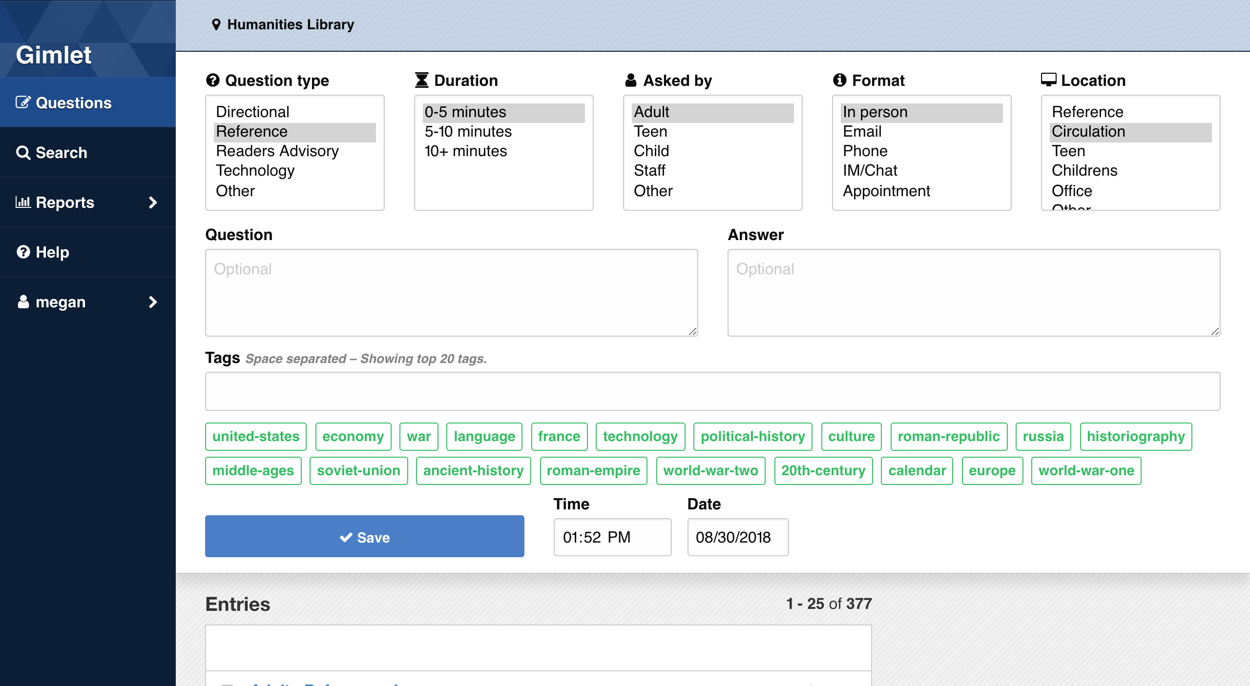
It’s a lot like the previous version, right? But… it’s so much more lovely. And, if you look closely, we’ve made some user-informed, strategic design decisions to enhance that core concept of simplicity.
Side Navigation
The most important change is that we moved the application’s navigational links to the side, on the left. This change rearranges the “visual priorities” of the page, as you look at it from top to bottom. The form is now clearly the page’s most important feature. Moving the navigation aside allows the form to pop-out and breathe unencumbered.
Keeping the navigation much darker (again lesser priority) than the principal task of the page (to enter data), also helps the form take full prominence here. The color contrast allows the darker navigation to fall backward on the canvas, pushing the lighter form to center stage.
Tagging
Tagging is one of the most important ways to capture quick data and trends in Gimlet. I recommend to all our clients they maintain a list of “promoted tags” that always appear on the form.
In Gimlet v2, we’ve increased the width of the tag input to take the entirety of the form width. Tags are also now styled as buttons, which better distinguishes them from each other. When a tag is applied it turns bright green on the page. Tagging entries is clearer and easier in the new design.
Typography / Iconography
Legibility is key to simplifying any repetitive task, so type is larger in the new design, which makes things much more readable (and also accessible). The default font-size is now a full 16px.
Lastly, web iconography has vastly improved since Gimlet was originally designed. Rather than little pixelated images (the star or envelop in G1), here in the new design we’ve added SVG icons to navigation items and as visual road-markers within the application. The icons grow and scale across all devise types easily.
What’s next?
We’re very excited to get the new Gimlet v2 design and features out soon. There’s no firm date yet, but the next couple of weeks should help us firm up the “preview” schedule for current clients.
Please stay tuned for more info. Send us your email address to keep up to date – just hit the button above.
Next up: I’ll write about Gimlet v2’s faceted search engine. Be back soon!
Cheers, Eric for Team Gimlet.